The construction industry had changed and was predominantly made up of large conglomerates that run huge projects. Management of retail, commercial, residential and industrial properties had changed as well, and was handled by management groups with many properties in their portfolios.
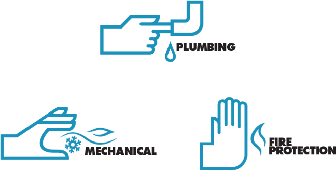
A Hand for All
In response to this growth phenomenon, Par Plumbing set out to build a larger organization. And with these corporate and operational changes Par needed to update their brand architecture to mirror the new structure. We set out to create individual but related identities for each of these entities.
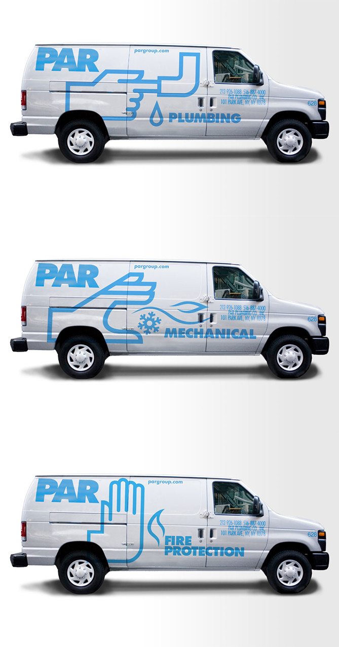
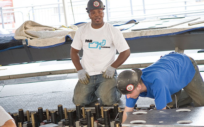
The original ”finger in the pipe” plumbing logo (a design from Percepted’s roots), already a familiar sight on the sides of PAR trucks was used as the linchpin for extending the brand.
The bold, linear style of the hand and symbolic representations lent themselves well to other variations. The use of the hand along with hot and cold air, and with a flame, quickly defined each business and linked them together. Each of these symbols was then used within the logo for the parent company, tying them all back to the parent.
Introducing The Par Group
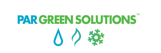
The company’s 4 divisions – PAR Plumbing, PAR Mechanical, PAR Fire Protection and PAR Green Solutions – became autonomous units. These were then reorganized under the parent company, The Par Group.
Going Green
Over the years, The PAR Group has played a leading role in the renovation of existing buildings and development of new buildings into energy-efficient, ecologically sound “green” buildings.
Par has benefited from a standout identity in the finger in the pipe logo and now has extended that across multiple entities. Still a standout, just bigger. You can visit Par at http://www.pargroup.com