The Pratt Center wanted to improve the overall presentation of content on their website in order to better communicate the important work they do. Simplifying the structure and emphasizing key elements made the site significantly easier to use and content easier to understand.
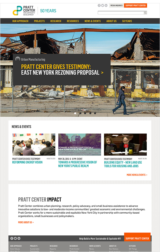
The Home Page
Improving the home page centered around eliminating redundancies and redesigning the main features window to have more impact. The result was significantly reducing the number of content areas on the home page. The redesign of the main features window made it graphically stronger with larger image area and headline text, and eliminated unnecessary text to reduce clutter.
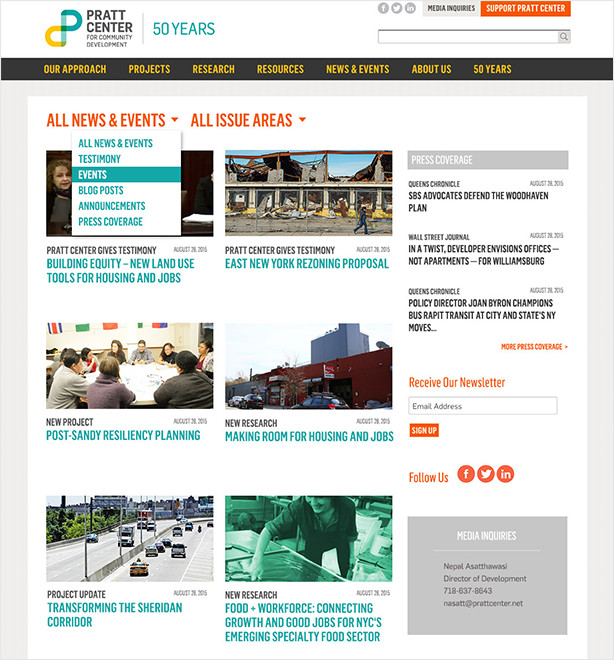
The News Section
The news section was reorganized into a more intuitive layout with a clearer distinction between original Pratt Center content and external news links. Each news story was given a thumbnail image and a descriptive heading, providing a much quicker understanding of the content.
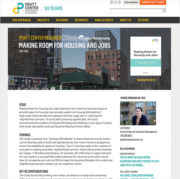
The Research and Project Pages
Research and Project pages were given new layouts that included labeling, subheads to aid understanding, and an upgraded look with greater visual differentiation between research pages and project pages.
The upgrades to the Pratt Center website makes the process of using the site easier, thus makes content more accessible and better serving constituents. You can check out the Pratt Center at http://prattcenter.net.